
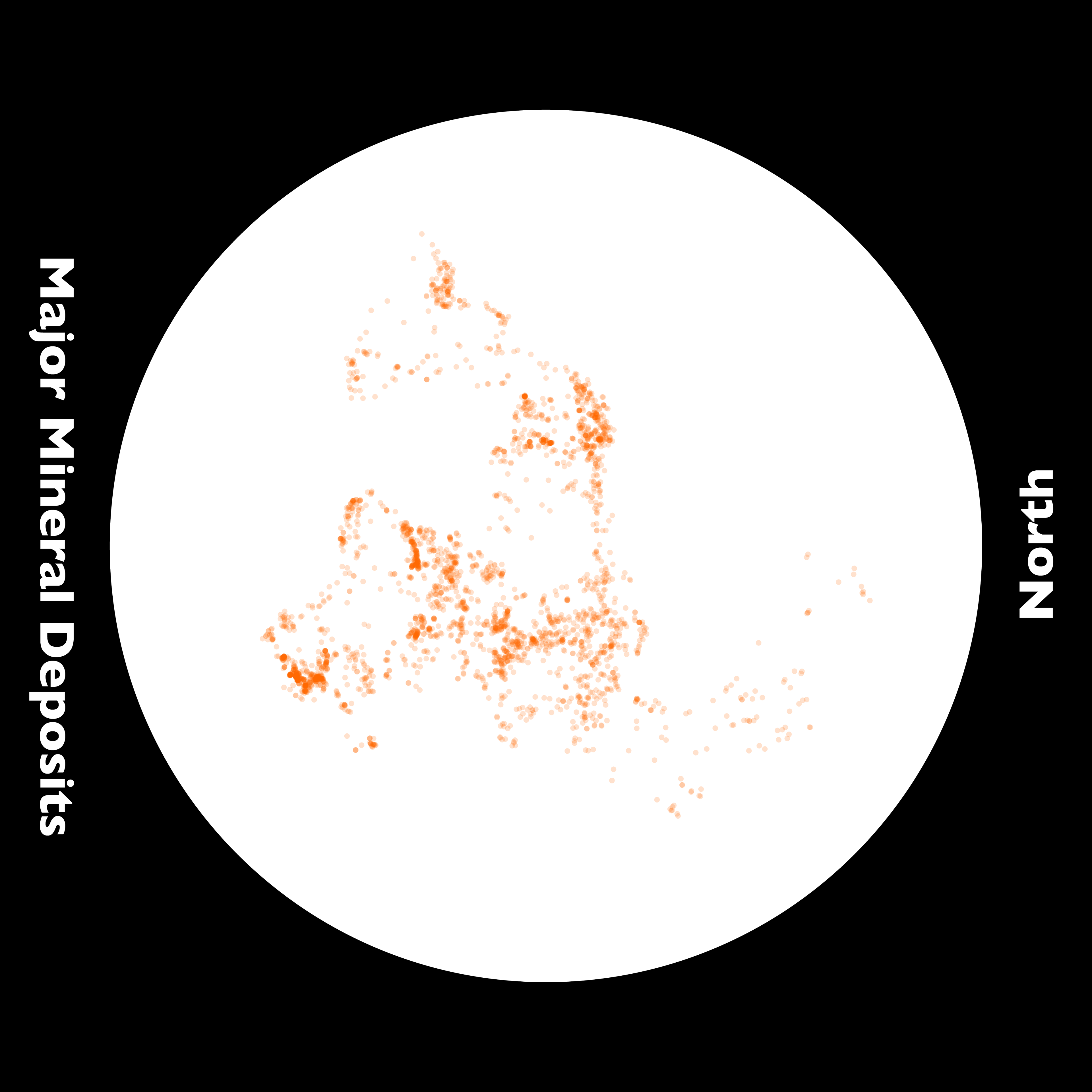
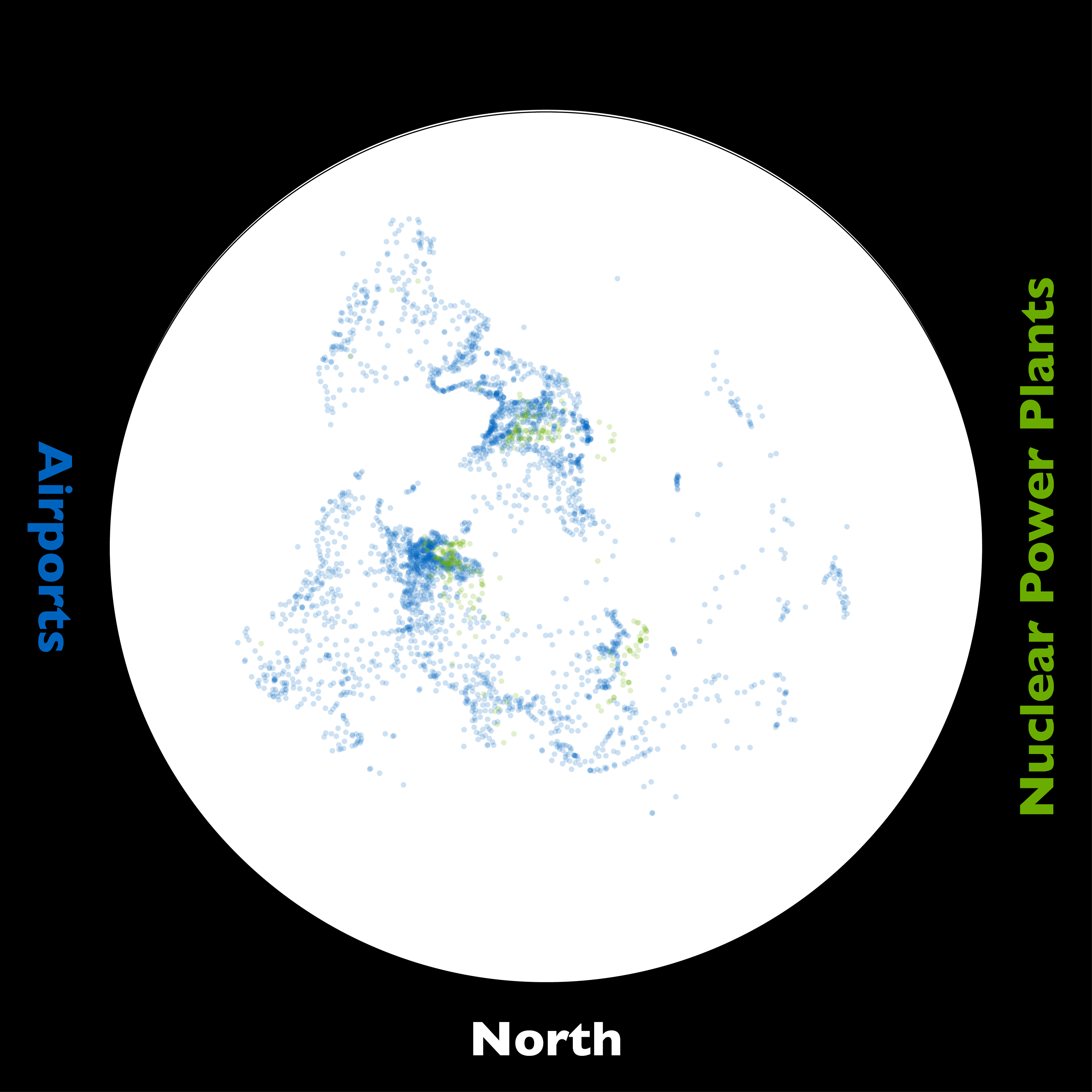
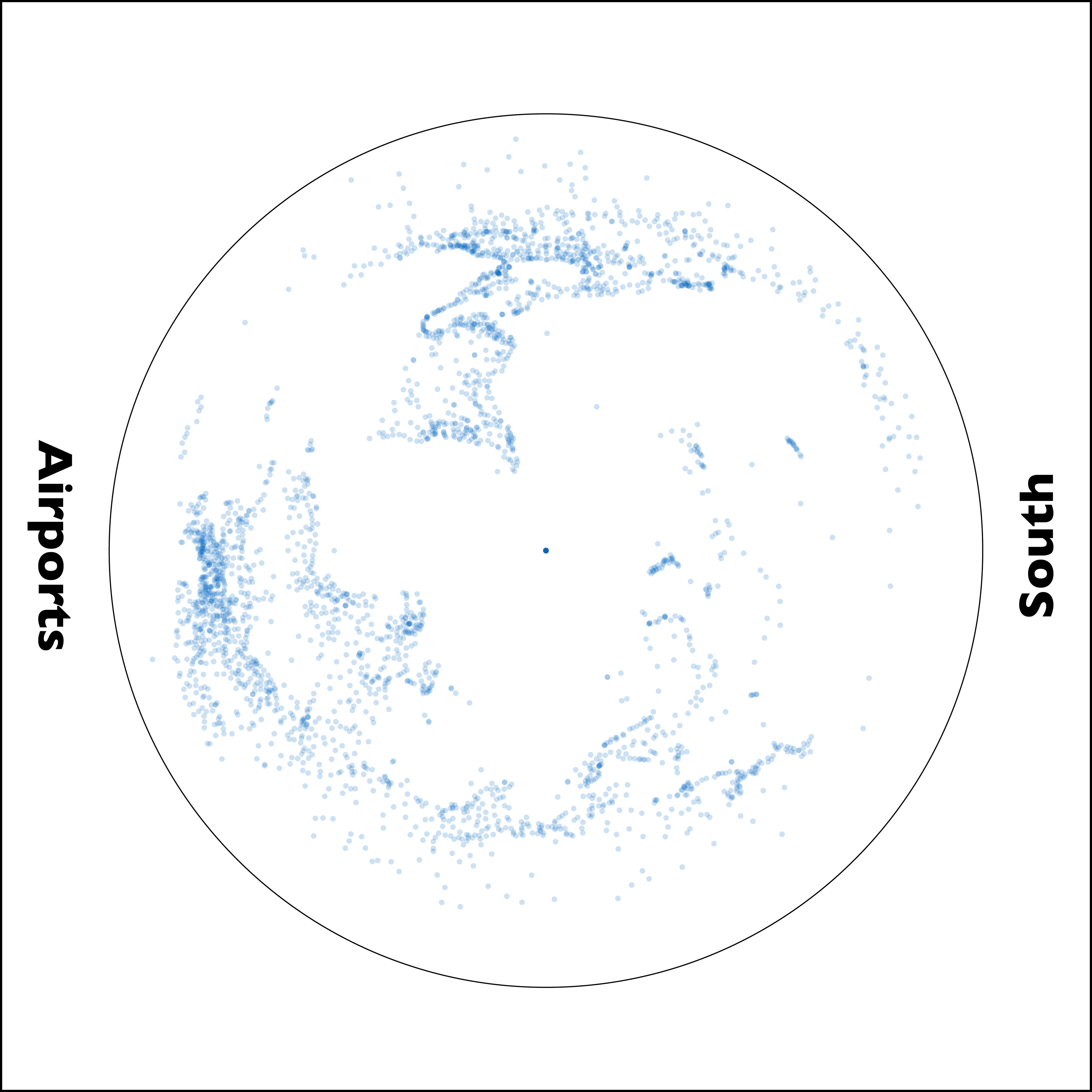
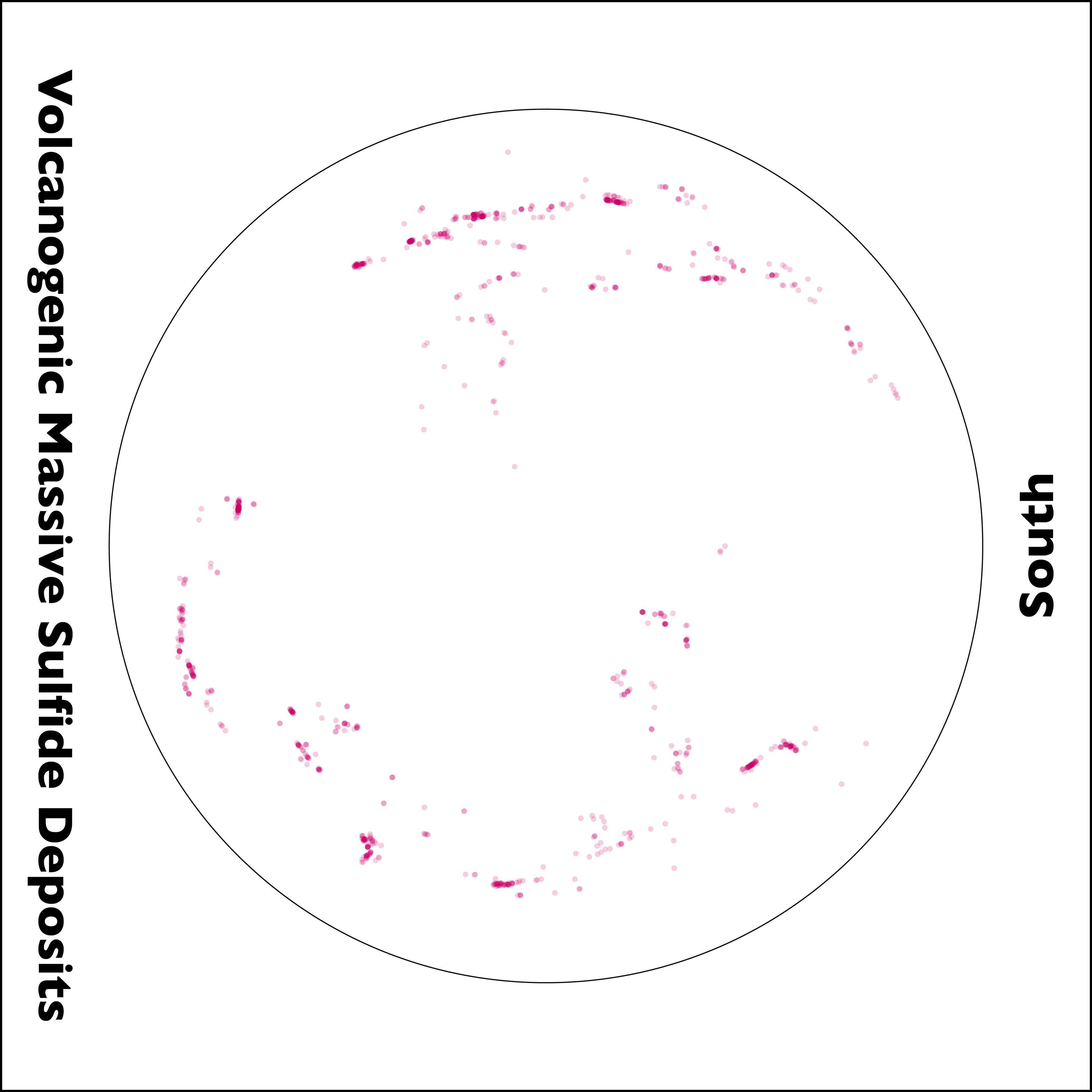
Unexpected Perspectives
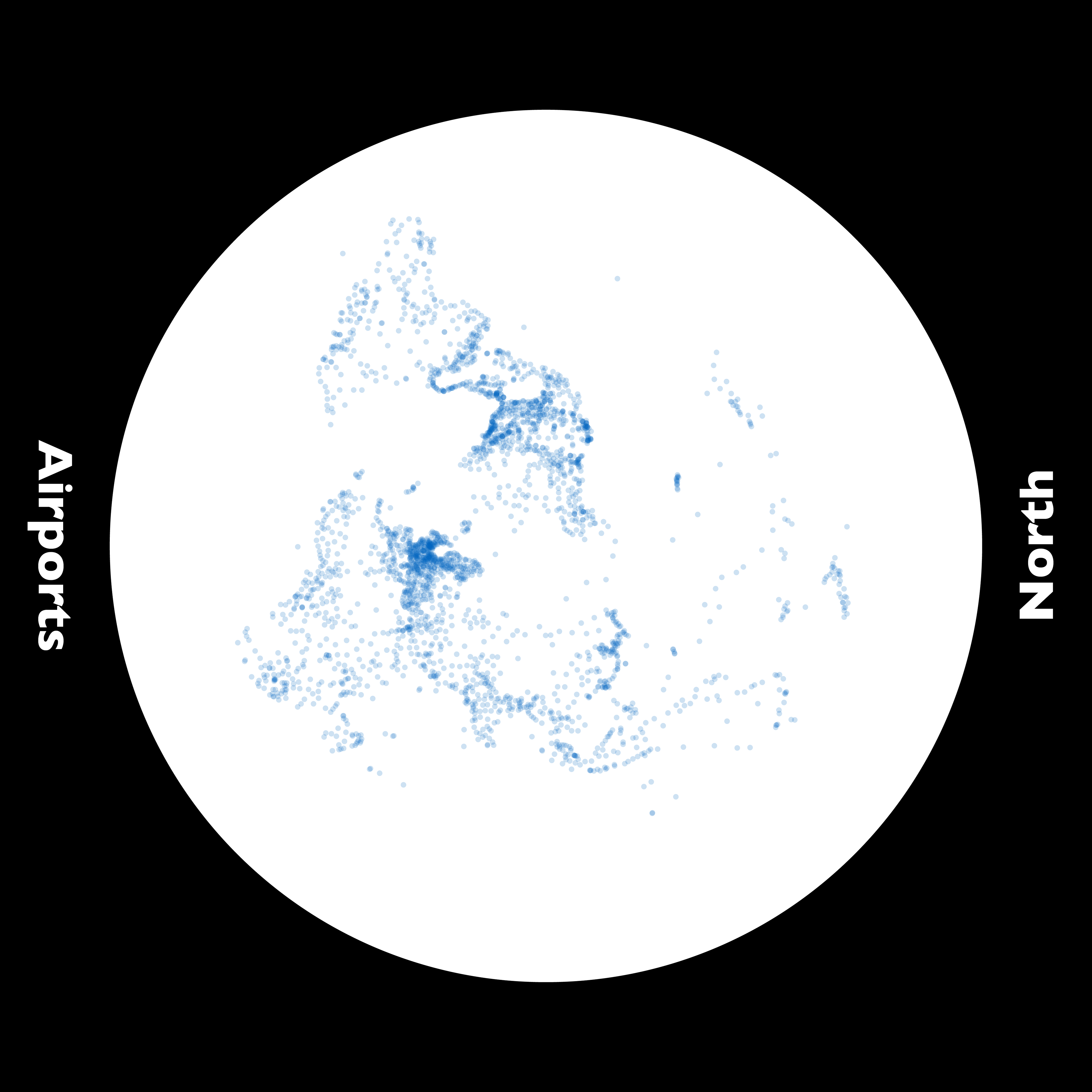
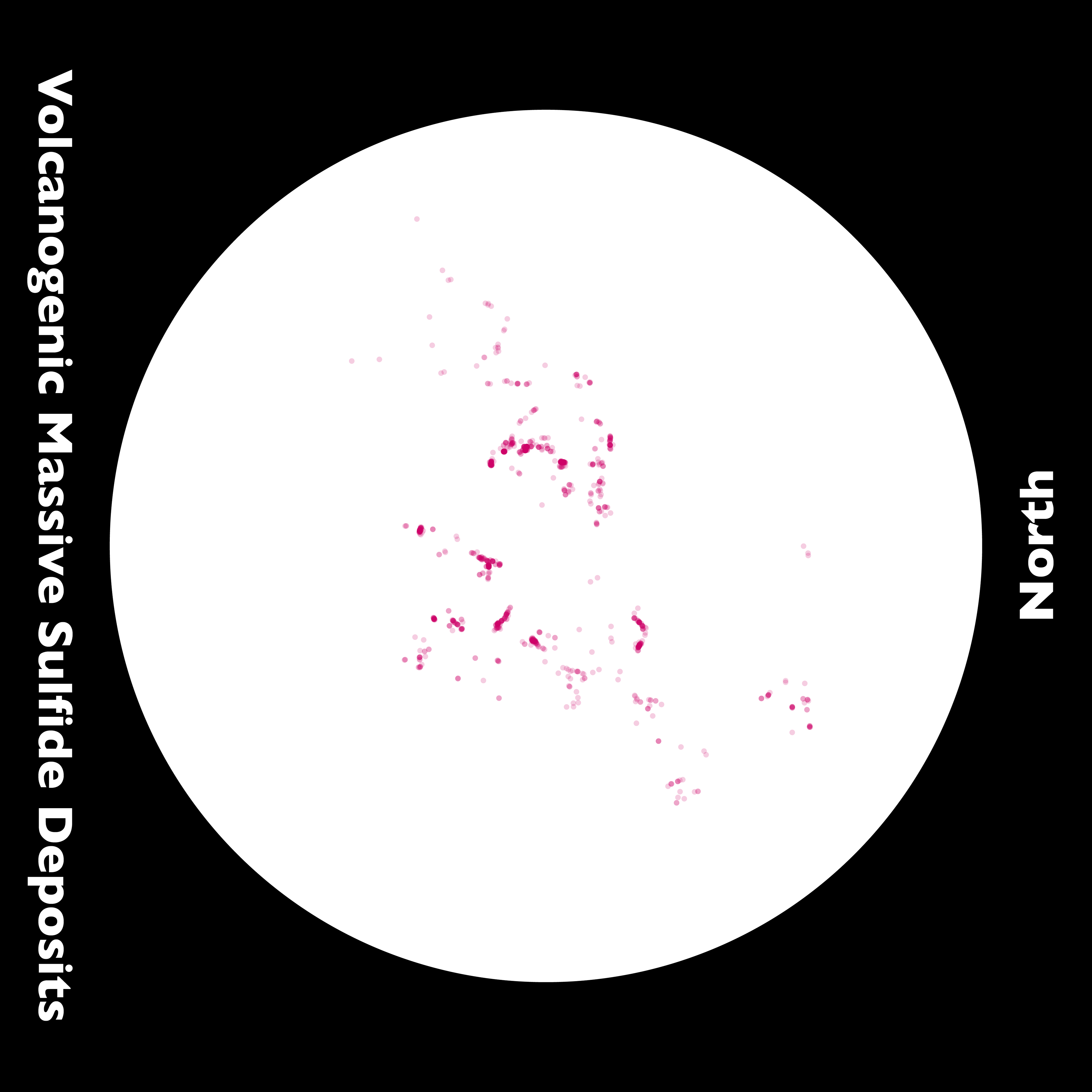
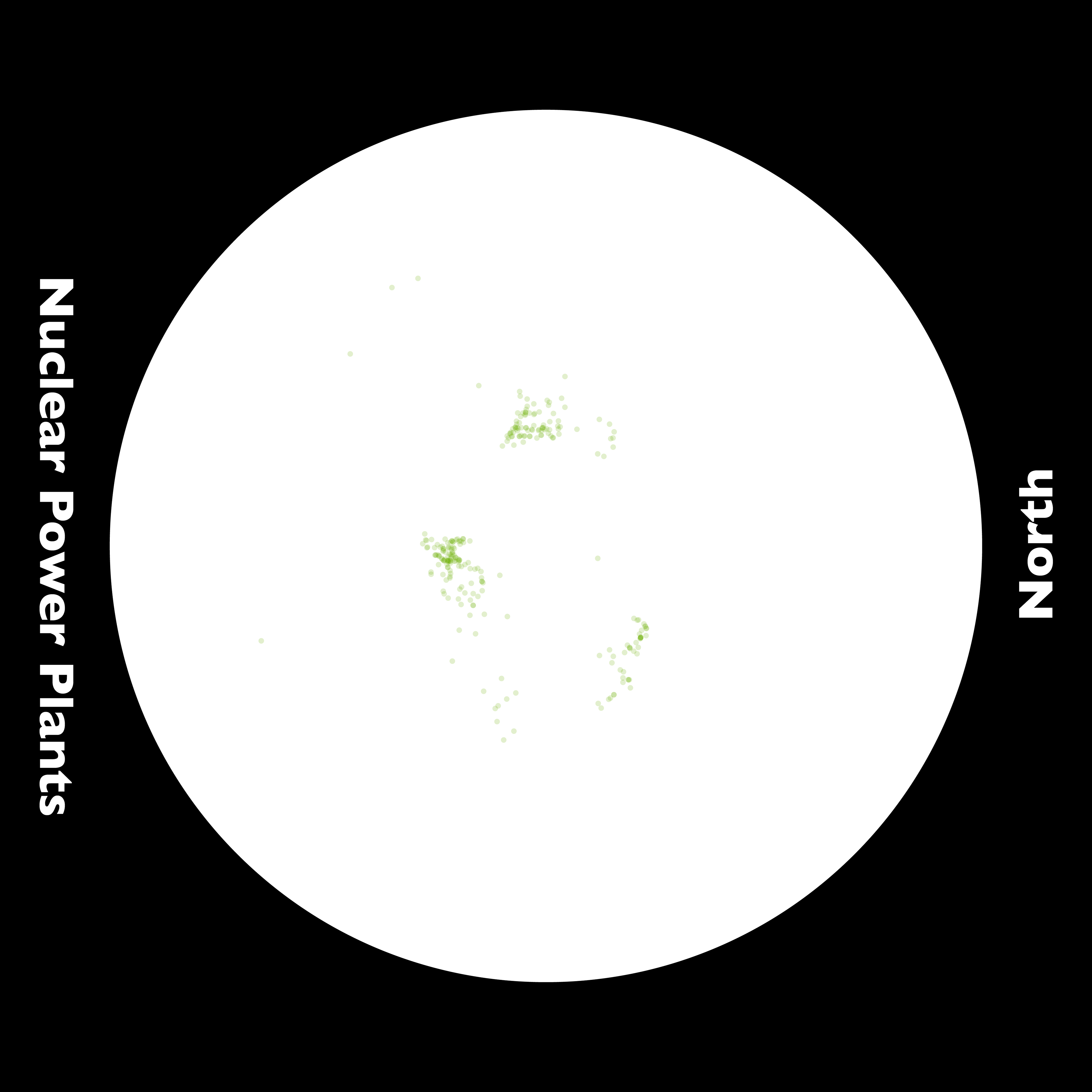
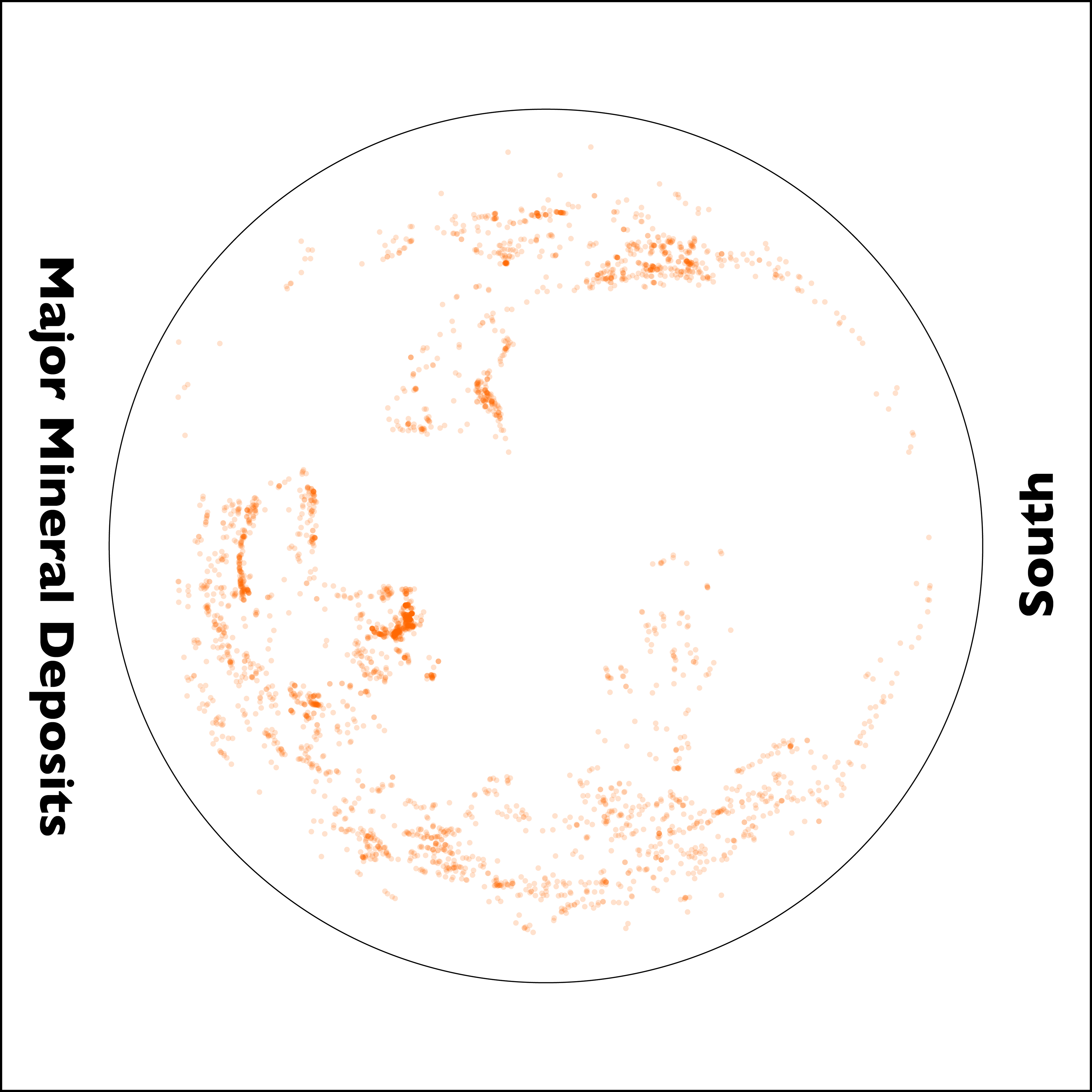
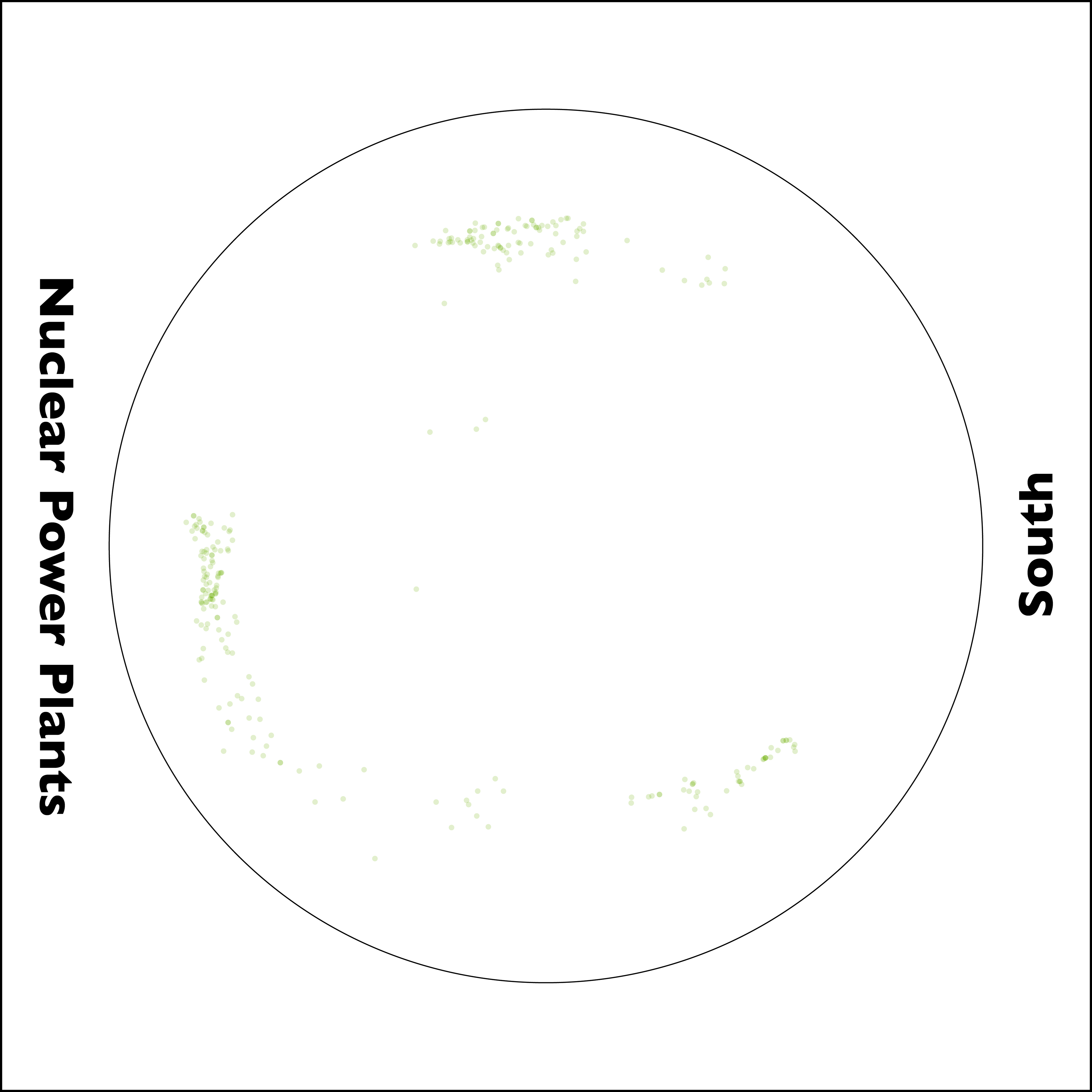
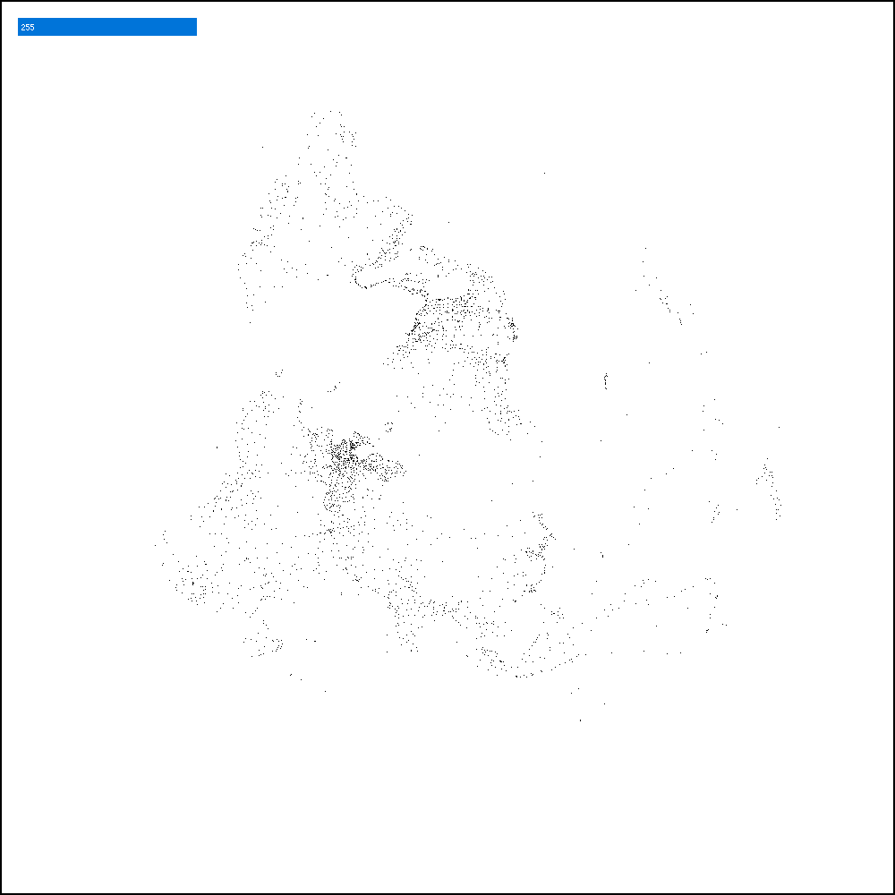
The project drew comparisons between different geographic data sets. The example above compares the distribution of resources in North centric and to South centric views. Below is an overlay of air airpots and nuclear power plants. Each one is meant to expose unexpected relationships and provide new perspectives to approach the data.

Visual Interations
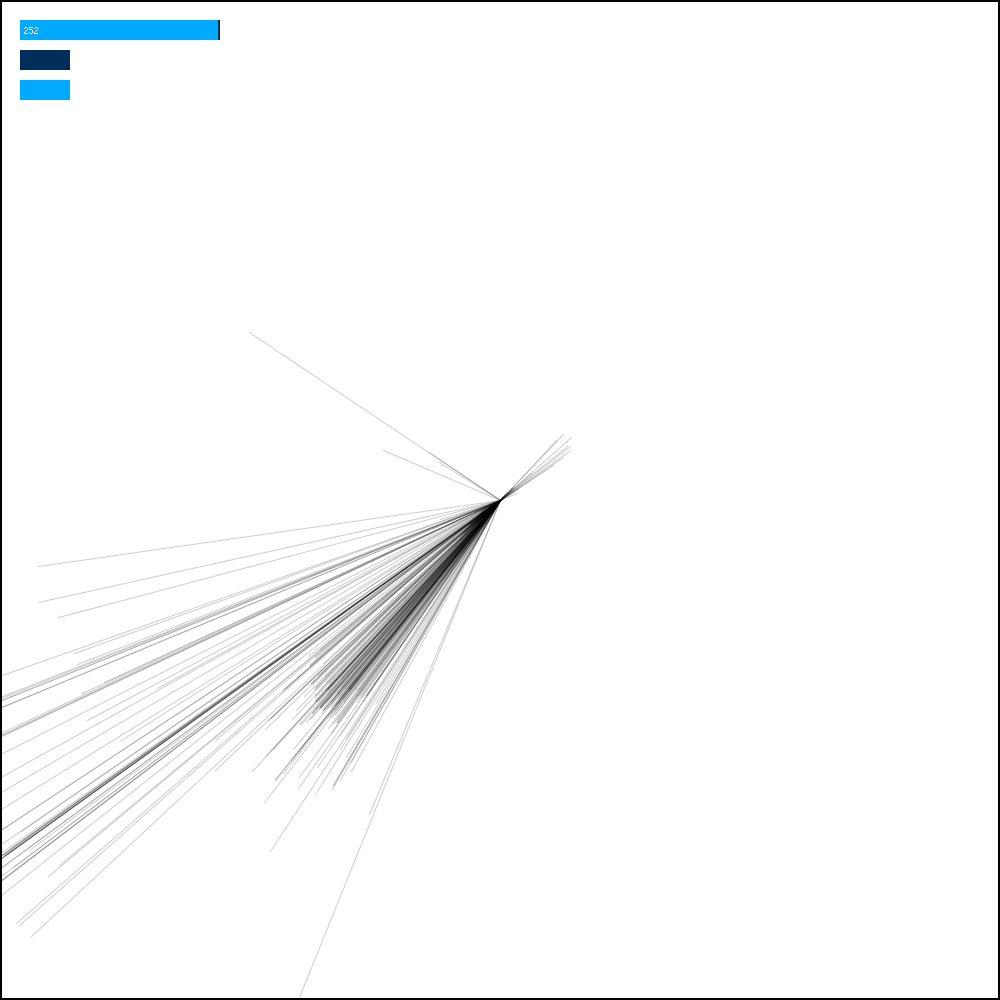
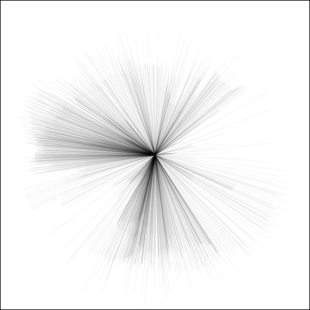
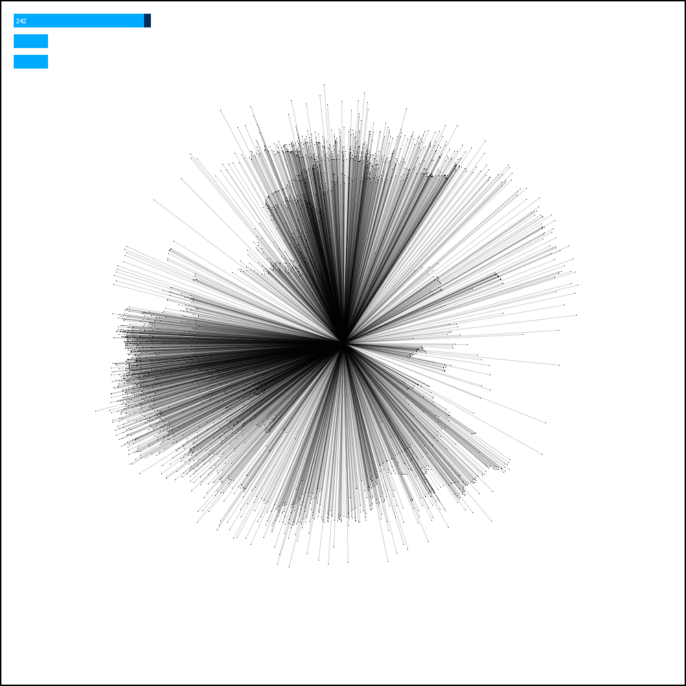
The early version of code created very abstract shapes and patterns. While I found these visually compelling, I wanted to created more meaningful and useful visualizations. The first version used lines extending from a central vertex, after which points were added to the end of each one. Eventually the lines were removed all together to reveal the map.

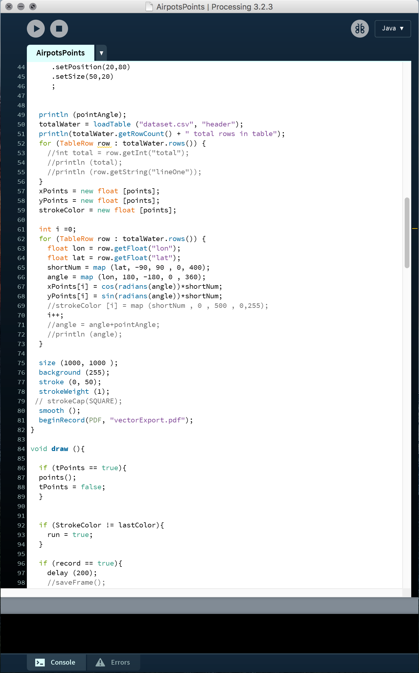
Parts of the code.